Tuesday, 13 December 2016

MUSIC VIDEO conventions research

To help evidence research into, and knowledge + understanding of, the media language of music videos, you need to analyse a wide range of examples.

From this, you should generate several well-illustrated pages with a summary (which you split into as many smaller topics, or put alongside aspects of your planning as you wish):
  1. the general media language (conventions; what makes it recognisable from other types of media text) of the format
  2. the media language specific to your genre/artist
You can see in this post on my blog dedicated to music video and the music industry (a very helpful resource for you to use), just a few of the elements you could pick out - here's a screenshot of some of those (from a much longer list):

So - you're looking for screenshots that will help you illustrate conventions. Always name the artist, track and year for any video you reference. If you can also screenshot 1 or more YouTube playlists (of videos you've viewed/analysed for your research) from your own channel, this helps show the range and depth of your research.

I will play you annotated clips from some videos I've blogged on, done an earlier vodcast on, and added to a playlist. We will pause after each clip so you can see if you can spot at least 1 more possible 'convention' demonstrated by this video. That might include any of Goodwin's points (he sums up six features that his research claims define the typical music video). You will find the necessary hyperlinks in this very useful post.

For The Pixies example, look again at this post...

We'll start with a discussion of the first 75 seconds of this...


...

Monday, 12 December 2016

MUSIC VIDEO research and planning evidence portfolio

An overview on how you might present research + planning evidence.
REPRESENTATION points to be added. 

UPDATE, 2018: Scroll to bottom for a quick guide on referencing/bibliography (crediting. acknowledging your research sources)
Use the theory tag to find more posts outling terms and concepts you should seek to apply - and you should of course be using handouts from Year 10.


...

A SIMPLIFIED 12 PAGES LAYOUT

(Statement of goals)
1: INITIAL RESEARCH: GENERAL FORMAT CONVENTIONS

2: ARTIST/GENRE RESEARCH: NOTABLE CONVENTIONS

3: OUR/MY IDEA + INFLUENCES

4: AUDIENCE RESEARCH
- PRIMARY RESEARCH
- SECONDARY RESEARCH
- INDUSTRY CONTEXT
- (if needed) IDEA UPDATE
5: PLANNING
- LOCATIONS, PROPS, SET DRESSING
- CAST + COSTUME/MAKE-UP
- STORYBOARDS/CALL SHEETS
- IMAGE USE PERMISSION FORMS
- PRODUCTION SCHEDULE (including cancelled but planned shoots)


GUIDANCE ON SECTIONS
I've included a suggested length for each section, within a range to give you flexibility. Include more of what you're strongest on.
1: INITIAL RESEARCH: GENERAL FORMAT CONVENTIONS 
2: ARTIST/GENRE RESEARCH: NOTABLE CONVENTIONS
KC M Lang is crucial here and on storyboards. Not just shot type/angles, but movement; edits/transitions (eg crosscutting, crossfade, layering) + pace (short/long takes). You should try to use semiotic terms wherever possible: anchors (makes clear the preferred reading); signifies/connotes instead of shows/symbolises; achieves verisimilitude (is convincing/realistic).

KC Representation is also key, especially of age and gender (but you may wish to engage with social class, sexuality, location/place etc).

The A-grade 'Candidate B' got marked down for generalising - there was a lack of specific examples of media language from their research.

LENGTH? Between 3-5 pages, including relevant screenshots
*********SUGGESTED FRAMEWORK - rather than tackle a series of individual videos in isolation, which you seem to find quite intimidating, use Goodwin's list of conventions as a series of sub-headings. Introduce the overall theory (see my Bagboy analysis for help) + briefly explain each of his suggested conventions. You can use multiple screenshots from a range of videos of each, using captions to make your analysis clear. HIGHLIGHT (bold+pink) any media terms you use, which should be quite a lot! Denotation of the shot type, angle, focus, edit/transition/SFX etc is important!!!*********

3: OUR/MY IDEA + INFLUENCES
A clear, specific breakdown of the narrative + role of performance. (THEORY TIP: It was Firth who argued all music videos are categorisable as 1 or more of performance, narrative, concept. Both groups are combining perf/narr). This can be as bullet points.

Highlight a simple, clear statement of your primary and secondary target audiences (GAPS).
A list of key influences to help make really clear the impact of your research.

LENGTH: 1 (may go on to a 2nd page, but better on 1. Provide minimum 2 screenshots)

4: AUDIENCE RESEARCH 
- PRIMARY RESEARCH 
- SECONDARY RESEARCH 
- INDUSTRY CONTEXT 
- (if needed) IDEA UPDATE
This is where the 'Candidate B' most impressed.

Primary research does not mean research into the primary target audience; it means unique, original data generated by your research efforts: eg opinion poll, survey, questionnaire, mood board. You have done this, but need to work on its presentation, including a clear summary of your findings for each of these sub-sections, then an overall one. (Research is also divided into quantitative, using numbers/data, and qualitative, based around interviews or panels for example)

Secondary research means from your reading of existing writing. An example would be points you get from articles like this [NB: contains some explicit language]. Make sure you credit the source, and make clear where you've quoted. Paraphrasing is usually better (putting into your own words, but still acknowledging the source).

Industry context is specifically using data (but also any user comments you think help) from YouTube, Spotify and other social media like Facebook, Twitter. You can contextualise by including general data/figures on these, such as the payment per 1000 streams. You've got this info, you just need to format and present it!

If you think your audience research points to some necessary change(s) to your initial idea and statement of target audience, BRIEFLY outline it. It is NOT a bad thing to do this.

LENGTH: 3-5 pages. Work to your strengths. If you've struggled with video analysis, do more on this - or vice versa.

5: PLANNING 
- LOCATIONS, PROPS, SET DRESSING 
- CAST + COSTUME/MAKE-UP 
- STORYBOARDS/CALL SHEETS 
- IMAGE USE PERMISSION FORMS 
- PRODUCTION SCHEDULE (including cancelled but planned shoots)
This could be almost half of your 12 pages. Key assessment phrases:
plan independently + effectively
flair and creativity through pre-production work
... [which is] convincing, fit for purpose, and engaged
uses appropriate forms and conventions
material presented skilfully
clear understanding of how audiences are identified and how production is tailored to audience needs and expectations
The key here is to think of this as a substantial snapshot of your planning. You can't really present a full, detailed storyboard - BUT you can show all of these as smaller images on a single page, and then pick out some frames or scenes to highlight in a more readable scale. What you should also do is use a different colour to individually highlight the influence of your research, plus how you're setting out to target the primary/secondary audience with the choices you are showing.

Likewise, a pic of fanned/spread out permission forms and call sheets, but some clearly visible detail from at least one of these.

Storyboards and call sheets are useful, but also any behind-the-scenes evidence:
  • before and after photos (or screenshots!) to show set-dressing, easy to annotate
  • specifics of costume - try to get a shot of each cast member looking as different as possible to their appearance in your video to emphasise care over costume
  • annotating can include reference to existing videos you've researched, or other intertextual links
  • groups must include very clear detail which evidences individual roles; if you haven't detailed your share of work on production set-up, planning, camera, editing, directing then you cannot get credit for this
  • groups should try to highlight different storyboard sections/scenes to help clearly individualise the 12pages, and link to evidence of individual contribution (I filmed/directed etc this scene)
  • hardware used (you can briefly reflect on digitisation, convergence) + software you plan (this is written as done BEFORE filming/editing) to use
  • try to indicate some planned use of SFX in storyboard samples
LENGTH: 4-6 pages. 

...

I can't embed the exam board doc here, but here's their marking of the example (2016 candidate B, assignment 3)
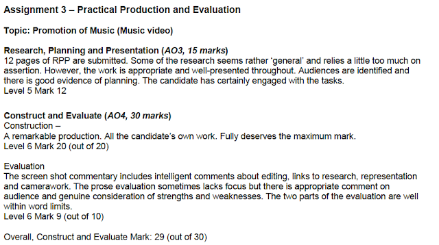

...

REFERENCING AND BIBLIOGRAPHY
Euan asks how he would go about a bibliography.
If thats a new term, it means a list of sources used within an essay, book, or evidence portfolio like yours.
You have used a source if you got information from it, whether you use direct quotes or not.
I'd suggest a 2-part approach to references:

1: LINKS WITHIN YOUR TEXT
State sources BRIEFLY as you go. Do this BRIEFLY by hyperlinking key words, DON'T show the full URL. Here's an example from a short blog post of mine:
The e-zine MetalSucks is one of many to feature the release of new Iron maiden figurines...
The examiner will only see a paper copy, but they can visually see you've acknowledged your source and made it clear where it comes from (an e-zine called MetalSucks). Notice that I use bold to make links stand out. Its quick + easy:
> Copy the link (CTRL+C or CMD+C [PC/Mac])
> Type your sentence
> Highlight a word/phrase
> make it bold (CTRL+B or CMD+B)
> Open the hyperlink window (CTRL+K or CMD+K)
> Paste the hyperlink in the box (CTRL+V or CMD+V)
> Hit ENTER or click OK

Here's another example from a MusiVidz blog post:
Its another reminder of the convergence between film and music video - bear in mind that the 1964 Beatles movie A Hard Day's Night [Wiki] is widely considered as having created the music video template (archetype) with its video-like scenes
In that case I just inserted a useful link in square brackets; I wasn't quoting from it.


2: BIBLIOGRAPHY
This is quite useful to help evidence your 'engagement' with the task, one of the things examiners are looking for. You can list videos, sites, social media, e-zines, books, newspapers etc.

Here's an example of how you might do this (probably at the end of your 12 pages).
BUT, you could also simplify this by doing a grid or collage of mastheads of books, sites, mags, papers etc you used for research, stressing this represents just SOME of your research. This approach would get you as much credit as the lengthier (longer?) list approach below.
This list style should not be used in formal essays by the way.


BIBLIOGRAPHY
A selected list of some of the sources used during my research.
Music videos viewed, analysed (YouTube links unless stated):
Miley Cyrus: Wrecking Ball; Pixies: Bagboy; [and so on…]
YouTube Artist Channels I Explored/Analysed:

Artist/Genre/Fan sites I visited:

Other Streaming Services I researched, including artist pages/channels:

Books, Newspapers, Magazines, E-zines used for research (including use of Amazon’s Look Inside and Google Books):
Simon Reynolds: Retromania;
Wikis I’ve researched:

...

Wednesday, 7 December 2016

MUSIC VIDEO 2016-17 Y11 rough to final cuts playlist

Playlisting is a great tool - a handy way for you to remember (and evidence, through screenshotting) which videos you've viewed for your research. You could (as I do) split this up into multiple themed playlists.

I'll gather your samples, rough cuts and eventually final cuts in the playlist below. It would be useful if you comment on each others. You can also view many past A2 music videos through my channel, and look at current A2 blogs to see more as they progress.

I'm happy to comment on a blog post if you prefer - just email me a link to the post where you've embedded your latest cut.
...

Tuesday, 6 December 2016

MUSIC VIDEO musividz blog

Just so that you can always easily find this ... I have been blogging for years now on music video and the music industry on my musividz blog. You can find LOTS of material and analysis on all 4 of your GCSE Media Key Concepts.

Remember too that this is hyperlinked on my main blog list (igsmediablogs) - scroll down and its under the A2 list:

You can have a look at post titles using the blog archive (click on any arrows to reveal posts for that month/year) - 1st screenshot below - or tag cloud (2nd screenshot below).
I clicked on the arrow to the left of the months to see the posts for that month. This text appears using the caption tool: add an image, click on it, and you'll see options including 'add caption'.
This is just part of my tag cloud, reflecting the 500-odd posts I've done, most of which I eventually went back and retro-tagged to enable students to more easily find relevant material.

MUSIC VIDEO some theory Goodwin Firth Hall

Some useful theory that helps you get into Media Language, but also Audience, Representation and, to an extent, Institution. Remember that I've blogged a huge amount on music video and industry at my musividz blog (primary target audience A2 or university students, but feel free to ask about anything you've read on there).

...

Tuesday, 29 November 2016

MAGAZINES specialist or hobby examples: martial arts

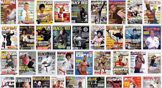
A quick look at the variety of examples available even within what may seem like a niche area: martial arts. A very simple google unearthed these resources within the first 5 hits - there is much more to be found.

1: USADOJO.COM listing of martial arts magazines (now updated here)

2: Google Images results - the variety is clear, though so are a number of stylistic/design themes, not least the cover shot...

3: Blitz mag - an Australasian martial arts title; note the emphasis on digital platforms...

Monday, 28 November 2016

Blogger - setting up a blog

Not a requirement for GCSE, but something you may find very useful for organising notes, and especially for archiving digital resources you've used, not least video.

See this post - and pop in and ask if you get stuck with blogging.

Tuesday, 8 November 2016

MAGAZINE Teen mags and digital disruption

This article is a few years old; the trends (digital disruption; changing nature of teen life, especially for females) it noted have accelerated further since it was published. The general analysis certainly still holds true though...


...

Sunday, 30 October 2016

TV AD RATES Bake Off example

To give you an idea of just how expensive those 30 second ads can be, it is estimated that once The Great British Bake Off starts airing on C4 (an ad-funded broadcaster unlike the license fee funded BBC), its likely to charge at least £100k per ad (£200k+ for the final).

Then there's the sponsorship deal, which would rival the biggest, Talk Talk's £10m annual deal with ITV which gets it an ident at the start and end of each episode segment, and much more through online and print campaigns. £8m is what C4 are expected to get.

Bake Off's triumphant finale leaves Channel 4 with tricky task http://www.theguardian.com/media/2016/oct/27/great-british-bake-off-triumphant-finale-channel-4-tricky-task?CMP=Share_AndroidApp_Blogger

Monday, 24 October 2016

ASSGMT 3: Music video PITCHING

Pitching is a common practice across the business world, not just the media industries - you may have seen pitching in any episode of The Apprentice for example.

When pitching you are trying to persuade a select audience, generally potential funders or financiers (though it can also be the band/artist in the case of music video, with directors mostly taking the creative lead in videos, not artists), that your idea is realistic and thought through, and that it has a clear target audience in mind and can successfully appeal to them (plus a secondary audience you would address too).

Pitches should be well illustrated, which in itself helps to show how well prepared you are, and that you have thought through the challenges your idea represents.

Your pitch therefore should have a PowerPoint or other means of having relevant illustrations on screen as you speak - at A-Level a video will be expected (you can do this if you choose), but Ppt is fine for GCSE. That needs to be emailed to me (not a Googledocs edit invite, an attachment) before the lesson.

POINTS YOU MUST COVER:

Wednesday, 19 October 2016

FONTS in fashion


InStyle UK magazine to shut print edition
http://www.theguardian.com/media/2016/oct/19/instyle-uk-magazine-digital-only-time-inc?CMP=Share_AndroidApp_Copy_to_clipboard

Tuesday, 18 October 2016

MAGAZINE research: publishers and audience profiles

To research your market, you need to look at rival PUBLISHERS, not just specific magazine titles.

Magazine websites are consumer-focused, but publisher sites are advertiser-centred. Therefore, they will usually provide clear information on the audience of their brands, vital information for any company considering advertising with the title.

Here are some links to get you started, but look out especially for Bauer, TimeIncUK (formerly IPC Media), Future, NatMags and Emap as major names.

MagForum.com

Wiki.

TASK OUTLINE (type up in Word):
1: List at least 5 of the major magazine publishers operating in the UK, then identify at least 3 currently published UK magazines in your sector (eg gaming, music, fashion). This quote from an analysis of the magazine industry (see post) should help...
Overall print circulation at seven of the major publishers - Future, Dennis, Condé Nast, Bauer, Immediate, Hearst UK, and Time Inc UK - fell 2.47 percent. 

2: Find and save as a picture AND copy into your document at least 1 recent example of their covers.

3: Crop these pictures in Word/Pages to show only the masthead.

4: Identify the publisher and make their name a hyperlink in your document to the publisher website page on the magazine, separately noting the magazine website if there is one.

5: See what you can find about the target audience from their site, and write this up.
Some publishers put very clear briefings on their sites to help inform potential advertisers, who need to be very clear on who reads the title so they can make an informed choice on whether that fits with their own target market. You can always email them to ask for an audience breakdown (usually called an advertiser pack) to help you with school research - check if anyone else is looking at this title, so only one email is sent to each company.

6: Analyse the mastheads - do you see any pattern or design techniques common to your magazine sector?
Also identify any individual design aspects from these examples you think might help you design a convincing masthead for a new magazine within your sector.

HOMEWORK: Complete the above as necessary for Friday. On Friday you should have 3+ masthead designs, 3+ possible slogans [previous homework], and 3+ possible cover images for your proposed new magazine.
...

Thursday, 13 October 2016

Y10 2016 Sept-Dec work

TBC
I'll add details on all work and deadlines here.

SEPTEMBER

the magforum genre list

OCTOBER
FRI 14TH
LESSON:
MASTHEAD RESEARCH + DRAFTING:
1: RESEARCH:
Find and list 5+ magazines in your broad genre (sports, music, teen etc). Save an image of a sample cover for each. Put the mastheads into a document [crop or screenshot], and in a short paragraph describe any masthead design features that you think to magazines of this type. These links will help you find examples:
UK mags (short list);
Wiki: British magazines;
Wiki: entertainment magazines;
Magforum: you can click by genre for a longer list;
2: MASTHEAD MOCK-UP
Mock-up 3+ versions of a possible masthead for YOUR proposed NEW magazine.
Create in Photoshop, then save as PNG (which you can paste into a Word/Pages doc [save any Pages doc: SAVE AS...WORD DOC]).
Provide a short paragraph (3-5 sentences) with each, denoting [describing] the font and design decisions then explaining how this reflects YOUR target audience (connotations; symbolic purposes). Address both primary and secondary audiences if you can.
List 3+ possible slogans (DON'T just stick with one at this stage), and explain as for the masthead your design choices (including language/phrases used) and how this would successfully target your specified audience.
OPTIONAL: Add draft skylines.
Complete masthead/slogan work before next lesson, Tuesday 18th.
HOMEWORK FOR FRIDAY 21ST:
3+ draft cover images on memory stick/emailed to yourself, with 3+ distinctly different anchorage text drafts.

NOVEMBER

Tuesday, 11 October 2016

Final Cut Pro X starter guide

There are further links to online guides etc in this post, on a blog where I gather tech tips/guides.
...
There are two versions of this - I initially did this without sound, and the video was longer as I rushed to get it online in time for a lesson.

The first video is shorter but actually has more tips and points, as well as a voiceover. Most, not all of my voiceover points are covered by the onscreen titles, so you can always mute the audio when re-viewing this to check on a particular tool or technique.

Keep a log of tools, shortcuts, techniques and general pointers that YOU can refer back to quickly.


VODCAST WITH VOICEOVER
By the time you come to do A-Levels, if you pick Media you'll be creating vodcasts - this isn't the most polished example you'll ever see, but follows the basic framework you'd want: a title sequence, relevant imagery/clips at all times, voiceover doubled up with clear titles (which I've resized to be much bigger than the default in FCPX).

I tweaked this twice, shortening the video but adding a VO, then making a few final additions but also adding my channel watermark.

CLICK ON THE READ MORE LINK below TO ACCESS THE VIDEO

Tuesday, 4 October 2016

Photoshop: a guide to key tools and techniques

Media Studies involves both print and video work. While Final Cut Pro X is the main software you will use for video editing, for image editing it is Photoshop.

Use the guides below to help you develop your skills with Photoshop, a skill that should come in handy for many other subjects and opportunities outside of school too! There is also a Photoshop iPad app.

After you watch a quick runthrough you will be aiming to create a slightly silly image like this by following the steps in the PowerPoint and summarised below:

10 STEPS TO COMPLETE TODAY'S PRACTICE TASK
  1. Create a new folder in My Documents called Media
  2. Save the 4 images (below the PowerPoint) into this (just right-click and save link as, and check its saving into the Media folder)
  3. Open Photoshop! (Start-All programs-Adobe Cs6-Photoshop or type Photoshop into the Mac finder: the little magnifying glass top right)
  4. Set up a new document (File, New), changing (1) the name to Elephant practice; (2) Preset to international (A4 should appear, then the preset will switch to show 'custom'); (3) swapping the width and height settings (W to 297mm, H 210mm); (4) Background contents transparent.
  5. SAVE THE DOCUMENT RIGHT AWAY!!! (File, Save As, select your Media folder) IF YOU GET A POP-UP ASKING IF YOU WANT TO KEEP COMPATIBILITY, CLICK OK.
  6. Open the 4 images into Photoshop using either the 'MiniBridge' tool or the simpler File-Open. Read 'THINGS THAT TEND TO GO WRONG' (bottom of the post) if you can't see the MiniBridge option...
  7. Add these to your Elephant practice document by right-clicking on the layer for each of these in turn; duplicate layer; and select which document to add it to.
  8. Resize and reposition the images. Put the Coke ad layer underneath the elephant layers, resized to fill the frame.
  9. Have a go with the magic wand and eraser tool to get rid of the background from the simplest image (on the desk). Use the eyeball (click it off) on the Layers toolbox (on the right) to get other layers to disappear! If you feel confident enough, have a go at one or both of the other 2.
  10. Save it as a jpg or png file (File-Save As). .
At this point you can either help others, and develop useful transferrable skills, or have a go at the additional tools illustrated in the PowerPoint: opacity, text, filters... 

THE POWERPOINT WITH SCREENSHOTS
You can have this open in your iPad or on the computer.
Please try to check this (or ask a neighbouring student!) before you put your hand up to ask a question that is probably answered in the guide! Check out the 'Things That Tend To Go Wrong' list further down this post; most issues can be solved by looking at this!


SAMPLE IMAGES
Save the following 4 images to your Media folder. You will find that the elephant images range from very simple and quick to edit (removing the background) to very complex and time-consuming!

Monday, 26 September 2016

BBFC visit

We'll review our visit to the BBFC HQ with 3 simple questions:
  1. What was the most surprising/shocking/interesting thing you saw or heard?
  2. Sum up the differences between PG, 12 and 15 (and the others, U and 18, if you have time), using real examples from BBFC Insight
  3. What industry is the film industry age classification body the BBFC also starting to work in, and why will this be problematic/difficult?
A simple 'bbfc' google indicates the range of great features of the BBFC site. Screenshot below
To learn more about the BBFC, you can access their excellent education service through their website. I have also blogged on the BBFC on several of my blogs, but especially on the 'mediareg' [media regulation, an A2 exam topic] blog; you can use the BBFC tag to find any post I've tagged as being linked to the BBFC, but might find this post especially interesting. Do note that I've commented on 18-rated films, but haven't embedded 18-rated content. I embedded videos, such as interviews with BBFC censors, in this post.

Friday, 16 September 2016

MAGAZINE COVER Kick it into shape

DECONSTRUCTION to CONSTRUCTION, and the 4 KEY CONCEPTS

ASSIGNMENT ONE introduces two of the four Key Concepts for GCSE Media: MEDIA LANGUAGE (what) and AUDIENCE (why/who). In all 3 assignments you will be analysing existing media texts, and detailing what is in them (the media language used) as well as why those choices were made.

When we consider AUDIENCE, age and gender are the minimum requirements, although wealth is among other factors we can consider.

Follow the steps below. You have 3 periods to work on this. If you don't complete STEP SIX in lesson time this must be done as homework for the next lesson. We will do STEP SEVEN together when I return. Note: you can start designing your actual magazine idea NOW!

THE MAGNIFICENT 7...STEPS [make sure you click on the read more link!!!]

STEP ONE: LABEL THE FEATURES OF THE KiCK COVER
A3 sheets have been provided; these are on the teacher desk beside the Mac.

As before, you're not just identifying where you see these features (MEDIA LANGUAGE), but also considering and writing why you think these are designed in the way they are (who they're aimed at: AUDIENCE, being clear on how means accurately describing [denoting] the media language choices made).

STEP TWO: ADD MISSING FEATURES
This cover is missing some of the features we'd expect to see (and therefore you must include when you design your own magazine concept and cover). Use an arrow/line to show where these would go on the KiCK cover, with details of the actual MEDIA LANGUAGE you think the designer should use (phrases etc) and a short explanation of why (how you think this will appeal to the target audience)

STEP THREE: AUDIENCE SUMMARY
Write one or more paragraph/s (in your books or on the back of this A3 sheet) on who you think this magazine is aimed at, being clear on why (provide at least 3 pieces of evidence from the text to support your argument). You should cover the gender/s and age range you think it targets (and any other details, or demographics* you think are useful).    *categories of people, eg nationality